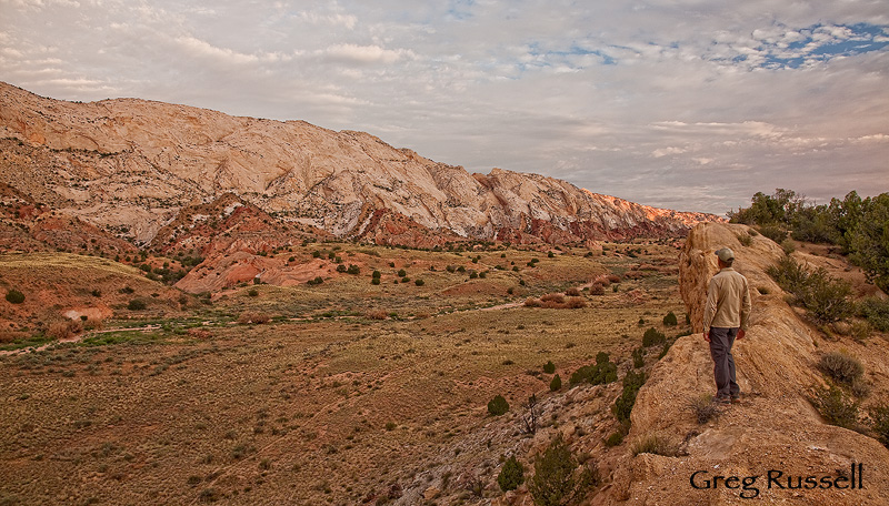
For several months now, I’ve been contemplating a change in the format of my website, one which speaks more to my evolving style and vision as an artist. Over the course of the last few weeks, those changes have taken form, and I’m proud to announce the release of my new website. Please take a look, either at this link, or by using the tabs you see to your right.
Rather than showcase all of my images, I’ve attempted to choose a few select images that truly are “mine.” In that sense, Alpenglow Images is now a portfolio site, rather than the “stock” site it used to be. Call me sentimental, but I haven’t been able to completely abandon my old format; you can still view it at this link.
There are still bugs to be worked out, and I’d appreciate hearing about any you find. Many of them are simply due to my novice skills in coding a website, but I will try to get everything resolved in the next few weeks. In the meantime, please take the time to look around and enjoy the images; they all foster in me a deep sense of connection with the land. I hope they do in you, too.
I have to admit, too, that going through my image catalog, choosing these photos for my portfolio has allowed me to see clear themes emerge in terms of my style. I think its an instructive exercise that every photographer should do from time to time.
Here’s to reflection and self-examination.


Very nicely done! I like the idea of splitting the website into a portfolio site and a stock site … might have to do that myself 🙂
Nice Greg! I just looked through all the galleries, no bugs that I noticed. I usually don’t like slideshow presentations, but yours are working so fast and seamlessly that it’s fine. The intimacy and simplicity of your compositional style is indeed coming through very well!
Looks good my friend, and no bugs that I could see. Your slideshow images make for a very powerful presentation. Great work.
Took another look through the galleries and other pages and darned if I can find a bug anywhere. I guess you need to start doing some entomology shots so there will be some. 🙂 As always, the person doing the creating sees the little things the rest of us cannot.
Everything glides smoothly from one fine image to the next. I’m inspired to follow your example Greg.
I like Steve’s comment 🙂 Looking fine to me too, well done.
I was wondering what happened to you lately… The site and images both look and work great.
Your new site looks wonderful, Greg. I like the dark background. I’ve always liked the name of your studio. I’m traveling now, but when I get home, I’ll take a long look.
Sharon
Greg, I really like your new home page, the format is simple and the choice of images is strong. Great work!