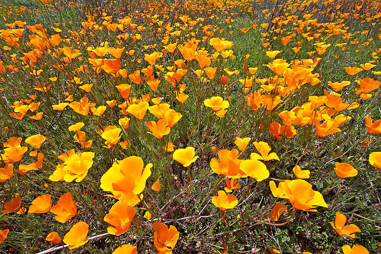
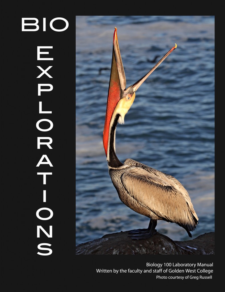
Over the last few months, I’ve been working on a website re-design, which I finally have implemented in the last week. You won’t see many changes here on the blog, but my image galleries have changed significantly, and I hope you’ll take a few minutes, using the links to the right, to look around and tell me what you think.
Rebuilding a website is not easy, especially for someone like me who doesn’t do it everyday. In fact, it’s exhausting; I would often walk away from the computer feeling like my brain had turned to mush. This is the total opposite of what I wanted to feel; I wanted to be exhilarated as i watched my website change, like unicorns and rainbows had surrounded me. That feeling hopefully will come later, now that I have finished the task and have had some distance from the monotonous coding. Despite the fact I feel like I lost some brain cells from the process, I do feel like every photographer should be either rebuilding their website or at least reevaluating it every couple of years. Here’s why.
In thinking about my project, I started in the most logical place: the image. The focus of a photographer’s website should be the photography. I began at the ground level, working upward by re-editing almost every image on my site. The creative process of photography, as you probably already know, only begins in the field, and it is too easy to edit an image, save it, sit back, and let it rest on its laurels for the remainder of its life. By doing the opposite and revisiting each image, I accomplished two goals.
First, I was able to spend time with every image and decide whether I wanted to include it in my body of work. As you browse my site, you’ll see that each image has its own devoted page. The focus is on the photograph, and collectively they speak to who I am as an artist. I’ve taken thousands of images, but my website has fewer than 100 on it right now–why wouldn’t I want to put my best foot forward?
Second, in the time since I’ve made some of the images on my website, my image processing skills have improved and I’ve got more tools in my digital toolbox. Applying those has the ability to enhance images already in my portfolio.
Deciding what images to include is always a challenge. Having edited and finalized my “candidates,” I pushed forward, choosing to include images that, despite not necessarily being huge crowed pleasers on social media sites, were consistent with my own artistic vision. Am I saying that every image you see on my site is terribly unique? No. However, every image tells a story, and I hope the viewer can connect with it in some way. Creating a personal experience for the viewer was not without sacrifice however, because I chose to eliminate certain images that may be more popular on social media, etc, at the cost of staying true my ideals. For a photographer connected to his/her work, that can be painful and difficult, however I feel that it’s a critical and crucial step in developing as an artist.
Finally, as I said above, I wanted each image to have its own dedicated page, such that any individual photograph is not lost in the mix, so to speak. I purchased my WordPress theme several years ago (during another website redesign) from a photography-oriented vendor, but have never been completely satisfied with their options for galleries. The dust has cleared this week, and I realize all I’m really using the theme for now is the built-in CSS (which every WordPress theme should have), but also the menu options. Everything else is homegrown or third-party plugin (for SEO, etc). I think it illustrates that pre-built themes can be a good starting point, but even photographer-centric companies still don’t have everything we are looking for.
Although it’s a lot of work and can involve some ruthless culling from the herd, revisiting your portfolio from time to time can give you a good opportunity to examine and reflect on the current state of your vision, processing, and presentation. Don’t expect any unicorns or rainbows, though. At least not right away.
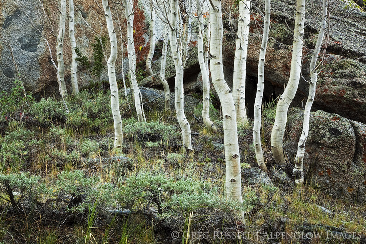



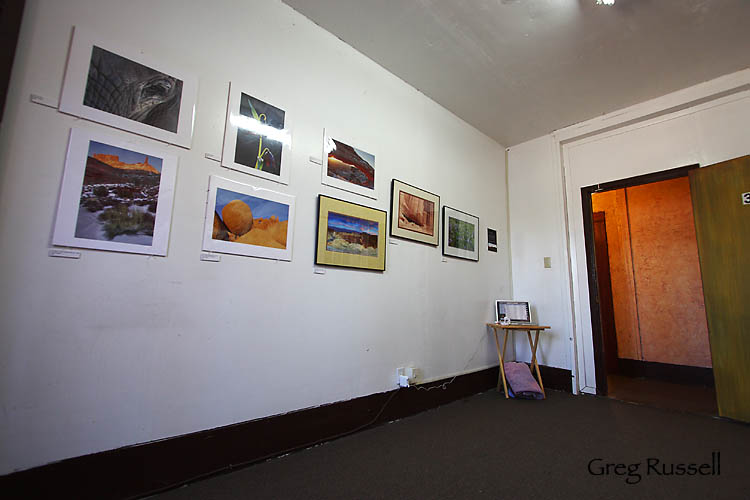 Studio 39 before the masses descended.