hdr

...now browsing by category


Ice Abstracts

Wednesday, January 5th, 2011

Several years ago, Ernest Atencio wrote an essay called “Little Wild Places”  in which he talked about wild places–even the smallest ones surrounded by city–as locations where we can rekindle our relationship with the natural world.

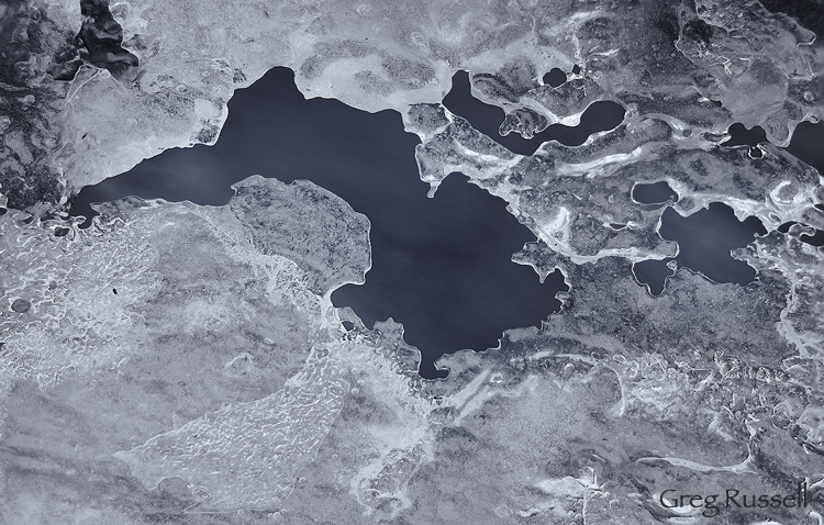
On our recent visit to Wyoming, I was lucky to have a creek to walk near several times.  Deer visit the creek daily; raccoons, pronghorn antelope, grouse, several small rodents, and other birds are not infrequent visitors.  One afternoon on my walk, the abstract patterns of the ice struck me and I attempted to make some abstract images of it.

abstract image of ice on a creek in winter

Ice Abstract I, December 2010

While making these images, I looked up, briefly, and saw one of the creek’s residents–a small mouse–bolting back into the underbrush.  I think it must have been as surprised as I was–what a strange being it encountered on the side of *its* creek!

abstract image of ice on a creek in winter

Ice Abstract II, December 2010

If you’re interested, there was quite a bit of technique that went into making these images.  Each one is a composite of 9 separate RAW files.  I wanted to maximize depth of field, so I focused at three separate planes through each image.  Each of these was then combined in Photoshop to maximize depth of field (I’ve blogged about this technique in the past).  At each plane of focus, I bracketed the exposure to maximize the dynamic range that was captured in the scene.  Finally, I converted the image to monochrome using Nik’s Silver Efex Pro, and added a slight silver-blue tone to convey the sense of a chilled winter day.  So, I guess these are HDR, focus-bracketed ice abstracts.  Whew…what a mouthful.  I hope you just think they’re pretty.

I was thankful to have this little wild place to not only rekindle my connection with nature, but also to foster some creativity in my photography.

How do you use little wild places?

Photo of the Month–May

Sunday, May 2nd, 2010

Spring is in full swing in southern California; on our walk tonight, I enjoyed the Brittlebush in full bloom, and noticed several migrant and summer-resident bird species who have arrived in large numbers: black-chinned sparrows, wrentits, indigo buntings, tanagers, etc.  With all of these changes happening, its almost impossible for me not to have “senioritis” of sorts.  By this point in the school year, seniors in high school and college have already mentally checked out, looking forward to their upcoming freedom, thus suffering from senioritis.  In the same way, I’m looking forward to long hikes in the mountains, lazy summer evenings at Mono Lake, and early mornings in the sagebrush of the eastern Sierra.

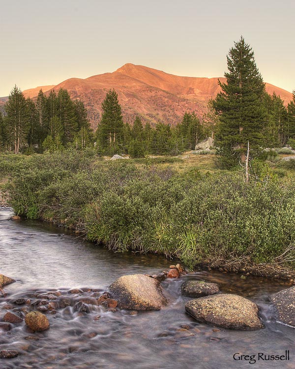
One of those summer evenings is the inspiration behind May’s photo of the month.  Last summer, on an early August trip to Yosemite and Mono Lake, we enjoyed a fantastic dinner at The Mobil Mart (Whoa Nellie Deli) in Lee Vining, then headed up to Yosemite to follow the sunset out of the park.  I started at Olmsted Point, worked my way east to Tuolumne Meadows, and finally photographed the last light of the day on Mt. Gibbs, the second highest peak in the park (12773′), with the Tuolumne River as a foreground.

This is a 3-image HDR shot I processed in Photomatix.  The river and forest were already in the shade, with the beautiful pink glow left on the peak.  I wanted to preserve as much detail as possible, so I chose to process this as a high dynamic range image.

Mt. Gibbs and Tuolumne River

Mt. Gibbs and Tuolumne River, August 2009

Here’s to your senioritis.  What are you looking forward to this summer?  What great summer memories do you have?

Shooting panoramas with minimal equipment

Saturday, February 6th, 2010

As a photographer, or even a nature lover, you’ve probably stood staring at a wide vista wondering how you can possibly do that view justice in your photographs.  Maybe you’ve even wanted to be able to print that picture large to give a room in your home the same feel as actually standing there.  Have you ever thought about taking multiple images of a scene and stitching them together into a panorama?

Shooting “panos” has become more popular in the last few years with the advent of point-and-shoot digital cameras that stitch the image in-camera for you, but if you want to shoot a panorama with your SLR, there are some things to consider.  First, and this should be a no-brainer, pick something interesting to shoot.  It may look impressive as is, but if you pick out something with substance, it will look even better!

So you’ve got your vista picked out.  Now what?  In my experience, the key to producing quality panoramas is making sure your tripod is level.  If this is the case, you will have much better luck at the stitching process.  I have used two different methods to level my gear; the first is via a two-step process that’s super cheap.

My tripod does not have a built-in bubble level, so I start by removing the head, and placing a bubble level (~$3 at Ace Hardware) on the tripod.  Tinker with the lengths of your tripod legs until you level the tripod.  Now, put your head back on, and you’ll see that it can rotate on a level base.
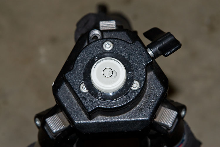
using a bubble level to level my tripod

By removing the head and using a spirit bubble level, I can make sure my tripod head is rotating on a level base.

The second, and more recent, method I’ve used is by putting a leveling base on my tripod.  I use the Manfrotto 438 leveling base, but other companies like Acratech also make them.  They’re more expensive than my first method, but they’re way faster and you don’t have to fiddle with your tripod legs.  To level your camera on your tripod use a hot shoe level like the Jobu Designs Dubble Bubble level.
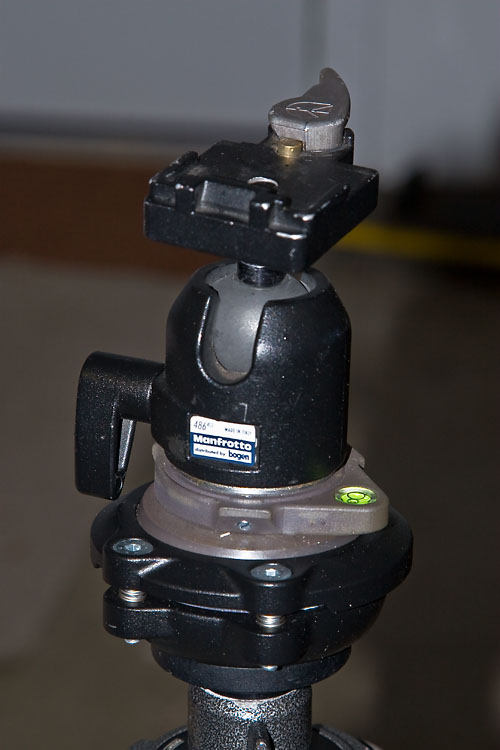
tripod head with manfrotto 438 leveling head

My tripod head can be leveled easily and quickly using the Manfrotto 438 leveling base.
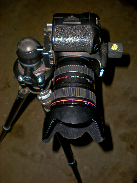
level and set up for shooting panoramas

After leveling my tripod head, I level my camera on the tripod using a hotshoe level.

OK, now you’re level.  The rest of the pano practically shoots itself.  I usually work from left to right, making sure to overlap my images by anywhere from ~1/3-1/2.  This makes for a lot of images (many of mine are 12-15 images) but you’re almost sure to get a better stitch at the computer.

A couple of other things to consider before we discuss stitching:

  • To shoot vertical or horizontal…that is the question.  In stitching, you’re almost guaranteed to lose a little of the top and bottom of your images because the software will correct for barrel distortion.  Because of this, I almost always shoot my panos in a vertical orientation.  That way I’m left with an image that is a little more proportional, instead of something VERY long and skinny!
  • Just like with any shot, sharpness matters.  When I shoot panoramas, I almost always use a cable release and set my camera to shoot in mirror lock-up mode.  This reduces any possible vibration, hopefully ensuring a better stitch.
  • Do not change your focus or any camera settings while shooting your panorama.  However, consider bracketing your shots.  That way you have more to work with at the computer, and you can even consider making an HDR panorama (let’s save that for another blog post, please).
  • I haven’t addressed the problem of parallax yet.  Unless you are rotating on the nodal point of your lens (or using a pano slider), you will have parallax issues if anything in your pano is closer than ~10-15 feet.  The cheap solution is to make sure trees, rocks, etc are further than ~10-15 feet from my camera, and that seems to work to subdue parallax.  The obvious downside to my method is that you’re constrained as to your compositional choices.

So, now you’ve got your image files, and you’re back at the computer.  Can you simply align them in Photoshop manually, then crop the canvas down to its final size?  I think this works for most people ~1% of the time (I’ve managed to do it once, and I’m 99% sure it was dumb luck).  Every other time, the barrel distortion, as well as other factors, will necessitate the use of software to help you stitch your images together.
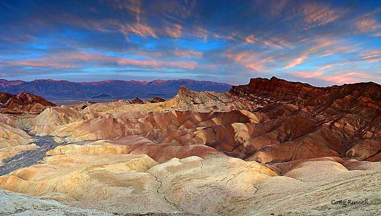
Panoramic photograph of Zabriskie Point at sunset, Death Valley National Park, California

Dumb luck. I stitched this 4-image pano together manually–I’ve never gotten it to work since.

For stitching panoramas, I use the software package Panorama Factory.  I like it because it has a fully automatic mode, which should work really well if you leveled your rig properly and provided enough overlap between images.  Alternatively, Panorama Factory allows for various levels of manual stitching, letting you define stitching points, and for the occasional difficult to stitch image, I like that mode a lot as well.  If you are interested in shooing HDR panoramas, Panorama Factory will stitch different sets of exposure identically so they overlay perfectly.  I have to admit that I’ve tried this once, and it didn’t work quite as smoothly as I’d like.  I’ve found that using the auto-align feature in Photoshop CS4 works well before blending images.

So, that’s basically it.  This tutorial was meant to get you taking beautiful panoramas using a minimal amount of equipment.  I hope you enjoyed it.  Feel free to add to the comment section if there’s anything I missed, or needs corrected.  Hope you can find this useful!

A panoramic photo of the Ritter Range, Sierra Nevada, California

An 11-image panorama of the Ritter Range, Sierra Nevada, California
Mammoth Peak at dawn

Monday, September 28th, 2009

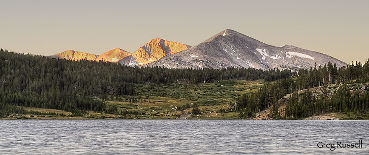
I’ve been sitting on this image since we got back from our Yosemite* trip in August for two reasons.  The first is that I haven’t had much time to give it more than a half-hearted attempt.  The second is that I didn’t know how to process it.  I was photographing Mammoth Peak** from across Tioga Lake, and the sunrise really was beautiful, but the wind was howling, and I was disappointed with the RAW files that I got home with.  I did a rough edit, but haven’t yet made a good effort to edit it properly.

However, today I had a chance to sit down and play with it more.  This is actually a blend of 3 shots, using Photomatix, and a technique I’ve described previously.

Mammoth Peak at dawn, Yosemite National Park, California, August 2009

*Although Mammoth Peak is in Yosemite National Park, Tioga Lake is not–its just outside the east entrance at Tioga Pass

**Mammoth Peak is not to be confused with the more popular Mammoth Mountain, about 30 miles south

Tone mapping a single image: RAW or TIFF? A comparison.

Friday, September 11th, 2009

In hindsight this seems like a no-brainer, but since its come up in a few threads recently (e.g. http://www.naturescapes.net/phpBB3/viewtopic.php?f=2&t=162031 ), I thought I would address the question of whether its better to feed a TIFF or RAW file into Photomatix for HDR generation. For this comparison, I chose to tone map only one image, not several. Although you probably already know the outcome, the end images are only subtly different, but getting there was quite different.

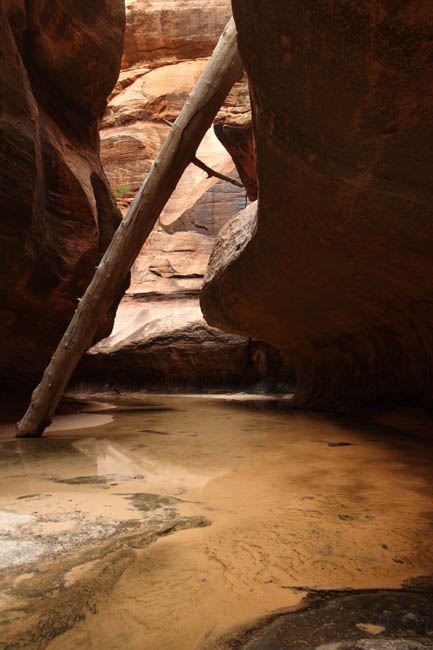
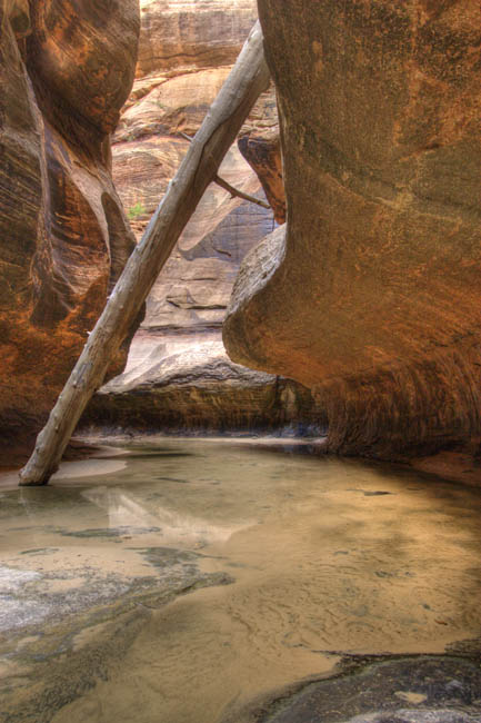
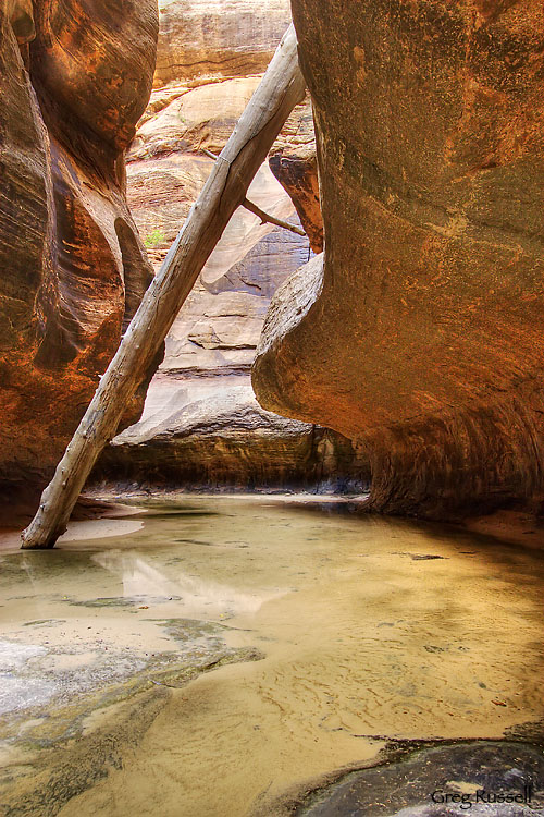
I started with a base image, shot in Zion National Park last weekend:

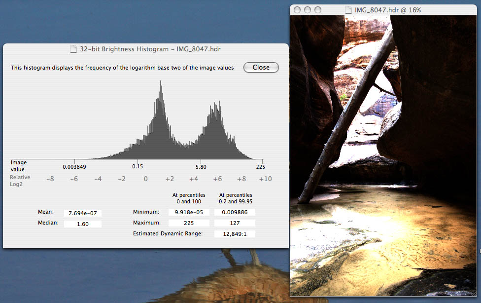
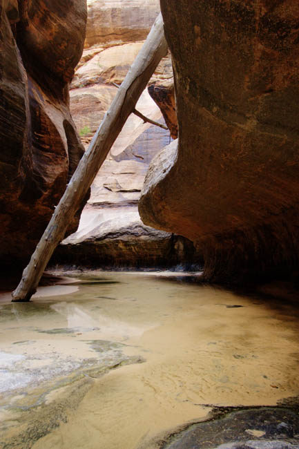
This is the RAW image; all I did before feeding it into Photomatix was adjust the white balance to “shady” in DPP. The TIFF image looked identical; all I did was save it as an uncompressed TIFF with no other change. As soon as I opened the RAW image in Photomatix, it underwent a process of demosaicing and decompressing. I could already tell that it would be taking advantage of the “extra” info in the RAW image. It opened the image as a “pseudo-HDR” image, and I was able to obtain some stats on it:

The TIFF image opened simply as the TIFF image, and there was no more information associated with it than with a regular image. I first tonemapped the images using the Details Enhancer algorithm, and saved them as TIFF files for use in PS. There wasn’t much difference between the two:

Here’s the RAW file tone mapped with DE:

And the TIFF file tone mapped with DE:

Then I did the same thing using the Tone Compressor algorithm:

The RAW file:

And the TIFF file:

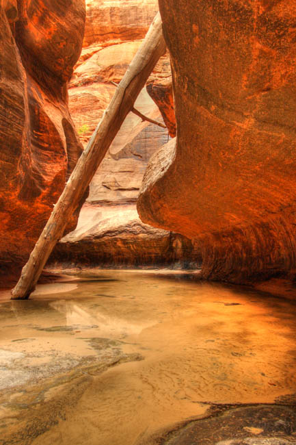
Whoa! I can only assume this funky-looking image is the result of the loss of information during conversion from RAW to TIFF early in my workflow. So, now I have 2 tone mapped images obtained from the original RAW file, and 2 from the original TIFF file. My workflow for each of the 2 final images was slightly different although not much:

For the RAW-derived images I used the DE tone mapped image as the base image in PS, and pasted the TC image over it. I used the Overlay blending mode at ~30% opacity, and the image looked pretty good. I did levels and curves adjustments (and also a desaturation of about -15), noise reduction with Imagenomic Noiseware, then some sharpening and I called it good:

For the TIFF-derived images, I again used the DE tone mapped image as the base image, and pasted the TC image over it. This time, because of the extreme nature of the TC image, I used a “Linear Burn” blending mode at about 25% opacity, and the image looked pretty natural. After normal processing (including noise reduction), here is what I got:

In the end the differences between the images are subtle, and I like them both for different reasons. The RAW-derived image looks more “natural”, but I sort of like the reddish “glow” that’s present in the TIFF derived image. The no-brainer here is that you certainly lose a lot of valuable information by using TIFF instead of RAW for this sort of application.

I doubt anyone cares as much as I do (haha), but this was an instructive exercise to go through.

High Dynamic Range photography, part II: fixing the halo

Tuesday, August 4th, 2009

Yesterday, I outlined one of the biggest problems with HDR photography I’ve encountered since venturing down that road a couple of months ago: the dreaded halo.  The “fix” of getting around it is surprisingly simple, and I’ll walk you through it with an image I recently edited:

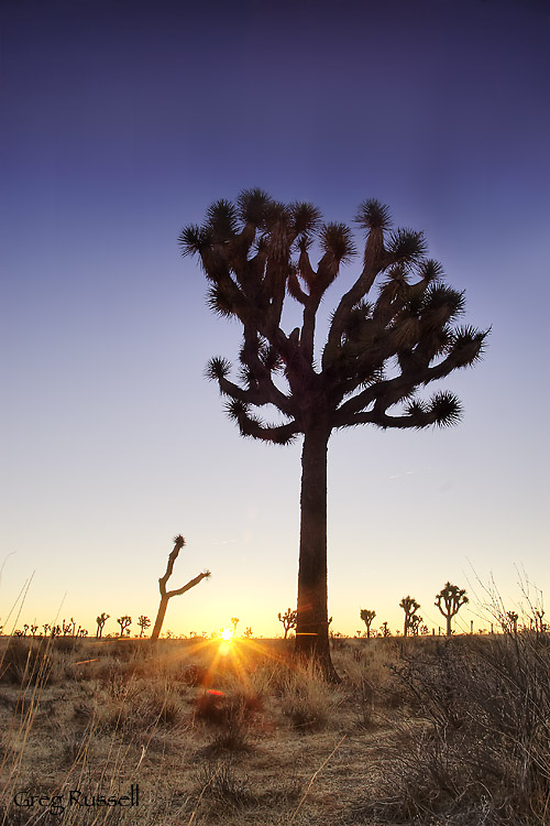
Sunrise, Joshua Tree National Park, California, January 2009

This is a 3-shot HDR that I processed just last week, after getting the courage to try HDR.  You might be asking why I’m not following through on the image I showed you yesterday.  Well, in the interest of full disclosure, I still haven’t processed it.  However, I will follow the same workflow on that image as for this one. 

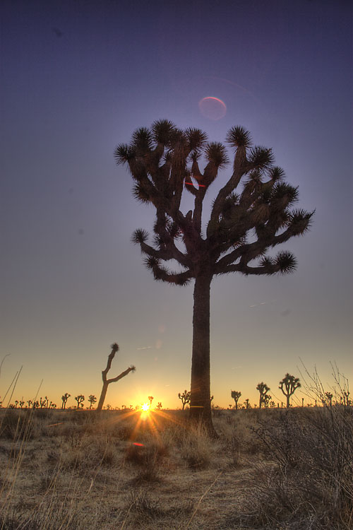
I won’t post the source images, but I will post the tone mapped images.  For my workflow, I generally follow Royce Howland’s suggested settings  for both the DE and TC methods of tone mapping.  With that said, here is the image tone mapped using the DE algorithm:

jtree_DEtonemapped

There is some lens flare that I’ll later clone out, but do you see the halo around the joshua tree?  That light purple line all the way around the whole thing?  That’s what we want to get rid of.  Other than that, this image doesn’t look too bad; its lacking some midtone contrast, which is also characteristic of the DE tone mapping algorithm in Photomatix.

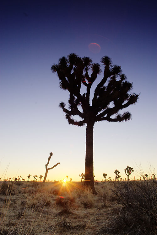
Now let’s look at the other tone mapped image, the one done using the TC algorithm:

jtree_TCtonemapped

What do you see?  First you see that its very contrasty–almost too contrasty–especially compared to the other tone mapped image.  However, what you don’t see is the halo!  The TC tone mapping algorithm does not give you a halo.  Good.  Now, we can open these two images in Photoshop and pick apart the best of both tone mapping methods.

I like to use the DE tone mapped image as my base image, and I copy and paste the TC image over the top of it.  The next step–the crux of this workflow–is to choose a blending mode for the TC layer that–at least mostly–eliminated the halo in the DC image.  I’ve had pretty good luck with Overlay, Color Burn, and Linear Burn, but probably the most success in Overlay.  Overlay multiplies the dark areas and screens the light areas, and logically would be good for eliminating the halo.  

Once you’ve settled upon a blending mode that looks more or less “natural”, you will need to adjust the opacity slider to make it look even better.  On this image, I settled for 35% opacity.  

I hate to be anticlimactic, but once you’re done blending these two layers, you’re pretty much done and can edit the image like normal.  There was a little halo still left at the top of the joshua tree, so I selected the inverse of the tree and just closed the sky to look less halo-ish.   In addition, I cloned out some lens flare, and applied noise reduction (I use Imagenomic’s Noiseware).  Other than sharpening and levels/curves I didn’t do much to it.  One thing I’ve found is that I don’t have to apply much saturation to HDR images–they look pretty good as is.

I hope that this has been helpful, and that you find it useful.  I’d love to hear feedback as you try this method with your own images!

High Dynamic Range photography, part I

Monday, August 3rd, 2009

Although its been popular for a while, I’ve recently begun working with multiple images to produce high dynamic range (HDR) photographs.  What is HDR?  HDR is a series of methods developed to produce a high dynamic range image from a set of photographs taken with a range of exposures.  There are multiple methods for producing an HDR image, from blending multiple shots in Photoshop to processing a single RAW image multiple times and blending those in Photoshop to using HDR software like Photomatix.

My goal here isn’t to tell you how to make an HDR photograph, because there are already fantastic tutorials out there, written by people much more talented than I am.  Probably the most complete tutorial was written by Royce Howland over at Naturescapes.net.

Because you can probably already produce an HDR image on your own, I want to share some nuances of the process I’ve learned to make your images look more realistic.  These aren’t new techniques, and I didn’t come up with all of them myself–to give credit where credit is due, Royce Howland, E.J. Peiker and Paul Stoczylas are the masters.  I’m but a student.

Part I: Getting rid of the halo

Photomatix is a powerful program and has a very user-friendly interface that pretty much does the work of producing an HDR image for you.  Because there are no monitors that can visualize that kind of dynamic range in an image, you must first tone map the image before being able to display it.  You have two options: Details Enhancer (DE) and Tone Compressor (TC).  DE is the default, and although it lacks some mid-tone contrast, it looks a lot better than a straight TC image which is way over-saturated.

The problem with tone mapping with only one algorithm is that you’re limited by each one’s constraints.  For instance, halos are a big constraint of the DE algorithm:

Towers of the Virgin 2Towers of the Virgin, Zion National Park, Utah, June 2009
This shot looks pretty good, but you notice at the junction between the sky and the cliffs that the sky turns noticeably light blue–that’s because I only tone mapped with the DE algorithm.

This halo can be especially problematic in images where you have trees against the sky.  In this series of posts, I’ll cover a couple of methods I’ve learned to make the HDR image look a little more  realistic and squelch that halo!

Stay tuned…

Following the light (and the alpenglow)

Monday, July 27th, 2009

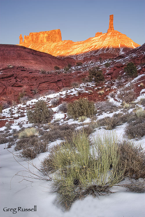
By now, hopefully you’ve had a little time to look through some of my photography, and you may be wondering what alpenglow is.  Alpenglow (from the German Alpenglühen) is an optical phenomenon that occurs when the sun is just below the horizon but mountains or other landscape features are still illuminated because light continues to reflect off of airborne snow, water, or ice particles still in the air.

The phenomenon is well illustrated in this photo of Castleton Tower, near Moab, Utah:

Castleton Tower, Castle Valley, Utah, December 2008

Having grown up exploring the canyons and mountains of the American West, it seems natural that I would be drawn to the phenomenon of alpenglow in my photography.  Again, I hope you enjoy what you see here, and please contact me if you have any questions!

I also encourage you to follow me on Twitter and Myspace, as well as on this blog.