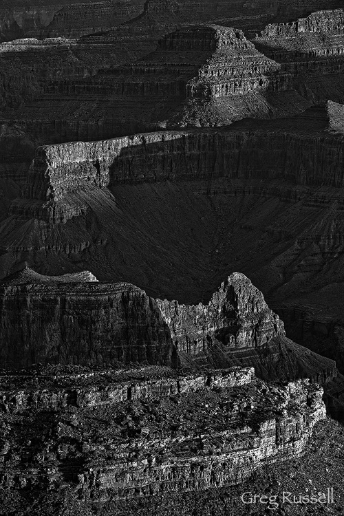
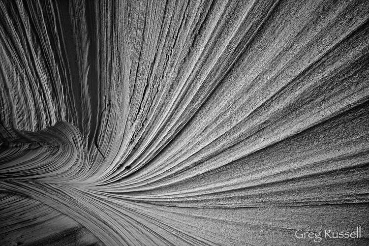
In January, I introduced my wind portfolio, a black and white set focusing on shape and form, and celebrating landscapes that have been created (in part) by wind. I am happy to add two new images to that portfolio.
The Grand Canyon is a place that has been shaped by the powerful erosional forces of wind and water for millions of years. Attracting millions of visitors a year, it is truly one of the seven wonders of the world, and has always captivated me. At sunrise and sunset, the receding hill layers create depth not only in the landscape, but in the imagination, and it is difficult for me not to imagine John Wesley Powell exploring this canyon for the first time, being completely awed.
“The wonders of the Grand Canyon cannot be adequately represented in symbols of speech, nor by speech itself. The resources of the graphic art are taxed beyond their powers in attempting to portray its features. Language and illustration combined must fail.”
–John Wesley Powell
The second image is an intimate landscape from Utah’s Grand Staircase-Escalante National Monument. If you have been in southern Utah in spring, you know the wind can blow, and you have have even felt sandblasted a time or two. How do you think the sandstone walls feel? The walls of this alcove have been shaped by grains of sand being blown against it for hundreds, probably even thousands or tens of thousands of years. Beautiful cross-bedding patterns have been exposed, creating some very powerful lines.
My Wind Portfolio is special in that 25% of the sales of these prints is donated directly to the Wilderness Society and I offer special pricing when you purchase more than one image from the portfolio. Please click here to view the entire collection.


While both are superb use of B/W,Sandstone Alcove stands in a class of it’s own. Great photograph Greg — one of the best I’ve seen anywhere in a long time…
Greg, love these additions. They are both are fantastic.
Greg, I agree that the Standstone Alcove is a class apart. Both are beautifully suited to B&W but the intimacy of the lower image is palpable.
I did of course mean “Sandstone”!
Thanks for the comments, guys, much appreciated! I have to agree that I really like the sandstone alcove a lot…I knew when I found it that it was something special.
I thought I liked your color take on the alcove, but this version is absolutely fantastic! Very nice, gentle take on the Grand Canyon too!
Thanks, Jackson, on both images! I appreciate it…
I know you had seen the color version over at WhyTake.net, but after thinking about it and the suggestions of a few people, I decided to focus on form, and am glad I did.
I’ve seen and enjoyed the color version of Sandstone Alcove and think that this conversion definitely takes it somewhere special. The combination of form, lines and indefinite scale really works so well in this image.
Thanks, Steve! I really appreciate it–it does seem that the sandstone alcove in black and white is a winner, and I do like it because I was originally drawn to the form and lines.
Absolutely love “Sandstone Alcove”, Greg. The color version is beautiful for sure, but the BW version let the viewers to focus of the essentials: lines, curves, and texture.
Thank you, Yiming! I agree completely that the B/W version is more powerful for the reasons you listed.