Having been pursuing the “photography business” for less than a year, I would consider myself a newbie. I make no apologies for that, because I feel like I’ve always been able to follow the lead of my mentors well, and I am quick to learn from my mistakes. However, its because I’m learning from my mentors that I’m having an issue.
One of the biggest complaints that I hear from people in the business is that with the availability of Photoshop and other image-editing software (both in-camera and in post-processing), “anyone can produce great photos.” They note that creative vision is becoming less and less common, and its being replaced with the “I’ll fix it later” mentality. I definitely see this (look around Flickr and you will too), and to some extent I’m guilty of snapping a photo, knowing that I’ll be cloning something out in post. You probably do too.
My issue, then, isn’t with my mentors, but with myself. How much can I justify altering a mediocre photo to make a good photo and still be okay with it?
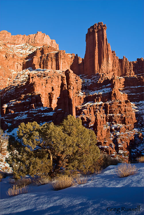
Take for example this image I’ve recently reprocessed from the Fisher Towers:

The Fisher Towers, in color
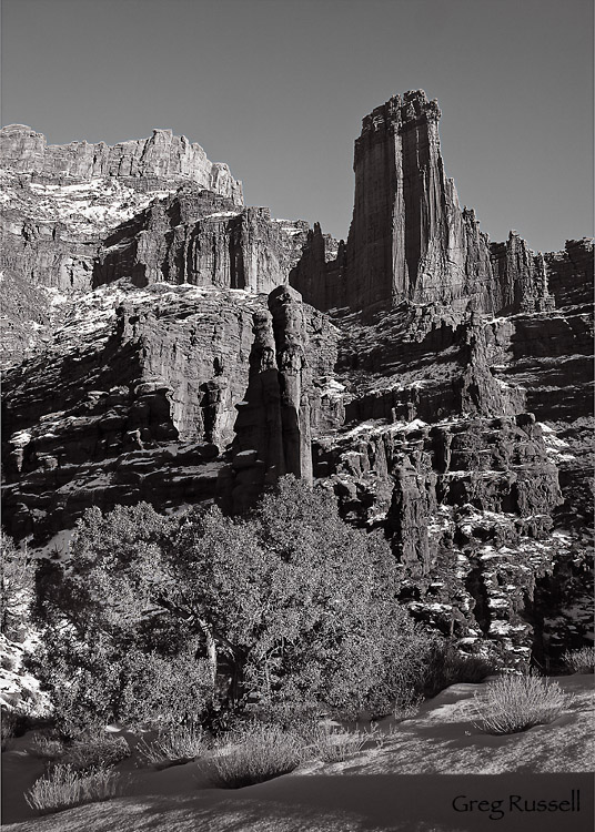
My problem with this shot isn’t the harsh light, or the fact that its not at all representative of how pretty the Fisher Towers can be. Its that I really want to like it. But, its just mediocre. Others on a Naturescapes.net forum recently agreed that its definitely not a wall-hanger. But, when I convert the image to black and white, that harsh light is suddenly working its magic.
The image still won’t win any contests, but its drastically improved. So, by digital manipulation, I converted a mediocre image into a better one. The problem I have with this is that I didn’t set out to make black and white images that day. Maybe I’ve just over-analyzed this.
I ask you, though: where does the creative process stop? I have a feeling most will answer indicating that for them its a continuum, but where is the line drawn? Knowing that I didn’t set out to make black and white images that day, are you okay with my displaying this as art?
I’d love to know your thoughts!


I’ve seen much of it as well, and I’m certainly guilty of it too. However I don’t think converting to black and white really portrays the argument. I’ve done quite a few shots that I was surprised to see work really well in black and white and I don’t feel in the least guilty or remorse for capturing it in that way because I think such a conversion is actually _extending_ the creative process even further into the post-production. Even in other mediums such as painting or sculpture you might think you’re close to done but then you flick a certain color in a certain place or make a minor scrape on a sculpture which can turn it into a completely different direction that you might want to keep pursuing. I personally think it’s part of the creative process and it’s not done (in this case) until you upload it to your site and put it on display.
However I’ve seen plenty of evidence for what you were referring to more along the lines of not worrying about exposure or cropping, for example. I think that’s a bigger issue knowing that they can crop however they want in Lightroom without affecting anything, or applying certain filters such as the GND also in Lightroom rather than fixing it when the shot’s actually being taken. I think that’s what eventually makes or breaks a photographer: when they’re conscious of those processes as the shot’s being taken and then taking the necessary steps to get the shot right in that moment rather than thinking “I can just fix it later.” It takes practice and while I may still do it, I personally notice myself doing it less and less these days. Sure it can be fixed in Photoshop, but it’s much easier when the shot’s ready to go immediately after import and I think that’s what separates pros from amateurs.
Greg, Hi there,
You want my sincere opinion?
B/w processing looks good, and besides not being a Wooow photo, I prefer the colored version, the “harsh” light isn´t bothering me that much, instead, the great blue – natural tones (BTW well done) with the golden lit towers plays some magic and makes it work for me.
I don’t think it makes a damn bit of difference Greg. It’s your art, and you can do what you want to do to make it be what you want it to be.
Like Mike said above — the process isn’t done until you say it’s done and you put it up for display.
Hi Greg, this is a great post that ought to instigate some discussion and not a bad photograph either. If you don’t like it personally that is what matters though. If that is the case I recommend putting it away and going back to the location a few more times to try to catch different light. I am going to presume to speak for the straight photography aesthetic on behalf of my father, Philip Hyde, though what I will say may not be what you expect. Speaking for myself, I feel that anything goes as long as you are up front about it with people. Also, I recommend listening to your mentors who are top professionals more than the feedback in forums. The feedback in forums can be valuable, but take it with a grain of pepper. From the straight photography standpoint I still feel converting to b/w is fair game. In the film era if you did not plan and have the b/w film with you, you would not be able to make the photograph a b/w. However, with digital technology you can make it b/w any time you please, so why worry about whether you planned it that way or not? The primary complaints and disdain today come from the misuse and abuse of color. One big controversy is the oversaturating of everything. This is neither in line with straight photography nor good taste. It shows up in most of the magazines now and seems to be all-pervasive. Everyone accuses everyone else of it. You have to be your own judge and know when to stop through experience and feedback from pros in person, not over the internet from a bunch of yahoos like me who do not have calibrated monitors. Fight gaudiness by going well-under what seems to be the common look today. Or keep away from that saturation slider in Photoshop altogether. As for removing items, obviously Adobe is doing their best to take photography where they want it to go by encouraging this with the ease of the operation in the new version of Photoshop. It probably comes from demand. My dad used to say to me, “If everyone jumps in a lake does that mean you have to jump in a lake?” Use your best judgment. To me the best test is: Do you feel embarrassed telling people that you took such and such out of the image? If not, leave it in. If you do not disclose the alterations you have made, that is your own decision. Everyone has to decide what they feel artistic integrity is and everyone will define it differently. Ansel Adams removed writing from one of his well-known images and caused an uproar, but he also pushed the envelope hard on what was straight photography in several ways by using a filter on Moon over Half Dome and the way he printed Moonrise Hernandez to name a few. This is one reason you don’t hear the Ansel Adams people talk about straight photography much. In many ways Philip Hyde followed more in the footsteps of Edward Weston. In digitizing Philip Hyde’s photographs we are very careful not to make alterations, even where there are certain eyesores or distractions. I use them as talking points to explain to buyers the difference between what we are doing with Philip Hyde and all the digital stuff out there. You will have some way to distinguish your own work. What you take out or leave in depends on who you admire as mentors, what line of photography you plan to associate yourself with and what your artistic goals are.
Thanks to everyone for your comments! I’m glad to hear that I’m not out of line, and that you feel I’m being overanalytical. What’s more, I appreciate your thoughts about where the creative process starts and stops.
David, as usual, I appreciate your thoughts. I’ve found myself more and more never touching the saturation slider in my image editing, where 5 years ago, I routinely boosted saturation 15-25 points. I think it makes a difference to let the light speak for itself.
When the creative process stops it’s time to find something else to do. I am a very selfish artist. My art is for me. I enjoy sharing my work and am pleased when others like it. But I am the final judge. So you should be also.
My 2¢.
Doesn’t this make you wonder about those so called black and white fine art photographers? Are they really fine art or they doing what you just did maybe adding a little extra this and that?